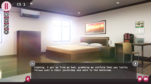
New UI in the works - First Teaser

I'm putting this here for those of you who don't have Twitter or don't pledge to me on Patreon and so didn't see this yet.
I'm currently collaborating with another VN creator, Eddio of Killigan's Treasure (click on the name of his project to check it out, by the way), to update the UI to Tennis Ace. It will get a full facelift, with all screens being redone under a new design aesthetic and, most importantly, under the same design aesthetic, meaning the design will be cohesive this time.
I have spoken about this in a few places before, but I have a strong dislike for the current TA UI. It is unpolished, makes terrible use of space, leaving tons of areas blank for no reason while seeming like it has content in them (especially in the textbox where, due to the slanted edges on both sides, it has a bunch of unused white space), lacks refinement. It was a UI I made myself, despite having no knowledge of design, just tacking on as many features as I could on Photoshop and calling it a day. It goes against what I've always wanted for Tennis Ace, which was for it to look sleek and professional, with a level of polish that one would expect from a project produced by a major professional studio.
Expect some more updates along the line as more of the UI gets worked on and finished. I myself am very excited about the whole thing and, hopefully, you guys will be too!
Get Tennis Ace
Tennis Ace
an interactive, furry, adult novel
| Status | In development |
| Author | WOTB |
| Genre | Visual Novel, Interactive Fiction |
| Tags | Anime, Dating Sim, Furry, Gay, LGBT, Romance, Slice Of Life |
| Languages | English |
More posts
- Hotfix19 days ago
- Version 0.79 (Jun) - Public Release20 days ago
- Version 0.78 (Keisuke) - Public Release49 days ago
- Version 0.77 (Shoichi) - Public Release85 days ago
- Version 0.76 (Jun) - Public ReleaseMar 18, 2025
- Version 0.75 (Haruki) - Public ReleaseFeb 15, 2025
- Version 0.74 - KeisukeJan 15, 2025
- Version 0.73 (Shoichi Good/Medium Path) - Public ReleaseDec 15, 2024
- Version 0.72 (Jun) - Public ReleaseNov 16, 2024
- Version 0.71 (Shoichi Bad Path) - Public ReleaseOct 18, 2024

Comments
Log in with itch.io to leave a comment.
Wow, the old UI got improved a LOT. You can't even call it "the old ui" anymore xD
Well done!!!